Data Science Cyling — Part 2, fitness over time
In a previous post I did a visual analysis of the relationship between heart rate and velocity. It always is a good start to get a feeling for the data when starting any data science project. My initial analysis already pointed out that the relationship between velocity and heart rate goes a bit wonky if we do not take the slope of the terrain into account.
The original goal was to get an idea of my fitness and how it develops over time. In this post I will do this in two ways. I will do a basic aggregation as a descriptive analysis to see how a couple of fit indicators change over time. Secondly I will do some basic modeling on the relationship between heart rate and velocity and investigate how this model changes over time.
Investigating my peak performances over time
So one of the most basic indicators of fitness is your peak performance, or the maximum speed and heart rate that you can keep for a set amount of time. Most training programs revolve around Functional Treshold Heart Rate (FTHR) or Functional Treshold Power (FTP), which are the maximum heart rate or power you can sustain for 60 minutes. So similarly I thought it’d make sense to look at a couple of indicators similar to this idea.
Because I have no power information, I am bound to look at heart rate and velocity. To do this I checked for each ride the maximum speed and heart rate I can sustain for a set of durations. For an individual ride a graph might look like the graph below. It shows that for shorter periods (like when I sprint) I can sustain higher heart rates and velocities. The longer the periods, the lower the heart rates and velocities.
To see how what heart rate and velocity I can sustain changes over time, I decided to look at my performances for 5 seconds (all out sprint), 5 minutes (a more sustained effort) and 30 minutes (which I think is close to what I would do when I pace myself). I plotted these over time and the results are shown below.

This graph tells me that I only bought a heart rate monitor in the beginning of 2015 (with my trusty Garmin Edge 500). I really became a lot faster as shown by the graph below. This is not really the case at the 5s sprints (admittedly I’ve never trained to sprint faster), but the speed I can sustain for 5 minutes has really increased over time.
This makes me hopeful towards the future. Apparently getting my kilometers in repays itself in being able to sustain higher speeds for longer times, which is reassuring. This way of looking at things is still very rudimental and thus I thinkt it’s time to start some modeling.
Modeling my cycling efficiency over time
In the previous post I mentioned that I would be looking at the relationship between heart rate and velocity, with the main idea that if I become fitter my body beomes more efficient and I will ride faster at lower heart rates. The data I have allows to model this relationship. I am mainly interested at how this relationship over time, so I decided to model this relationship per ride.
I made a very crude assumption that velocity is a polynomial function of heart rate. The rationale behind this is that my heart rate is linear with the work I do, but that the amount of work that gets transformed into speed decreases as my speed increases. This seems like a fair assumption, as air resistance indeed increases quadratically with speed. I account for the slope of the terrain as well, which I model as an interaction. In conclusion, for each ride, I fit the linear regression:
velocity ~ (heartrate + heartrate²) * grade
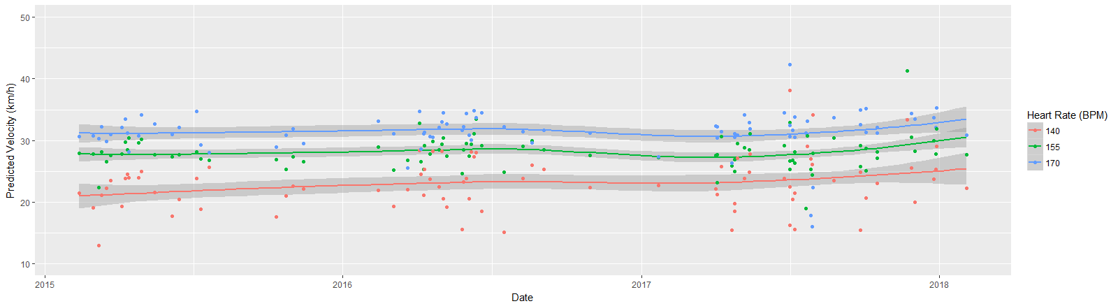
After fitting this regression I predict the velocity for a set of predefined heart rates (140, 155 and 170 bpm) and flat terrain. This gives me per ride three predicted velocities, that I can subsequently plot over time. The resultant plot is shown in the header of this post, but for clarity also below. This graph can be roughly divided in two parts. The part until June 2016 (when my son was born) with a steady increase mainly in the speed at 140 BPM heartrate. Then a whole lot of nothing and a huge decrease of speed at 155 and 170 BPM heartrates. And then finally in 2017, the year I cycled more than ever before, an increase in velocity for speeds at all heartrates. Interestingly enough, the speed at 140 BPM has been increasing quite steadily and does not appear to have been affected by the break between June 2016 and March 2017. But this is in part due to the fact that there is way more variance at this heartrate, because I don’t train nearly enough at it.
This post describes a first step in modeling changes in fitness over time. There are still many shortcomings: the model used to predict velocity was very straightforward, the noise in the input data is still quite significant and the modeling of the effects over time is very basic (loess smoothing). These analyses however do provide a nice starting point to start some more in-depth modeling. Add to that the fact that I’m now training in a rather structured way, there will be more and more data available to check the findings and I’m confident there will be enough to create a whole series of Medium posts.
If you enjoy what you read and have any ideas from either a cycling or training perspective, or from a data analysis point of view, I would very much like to hear what you think of this approach. My plan is to create an app or website around this method, if the insights prove to be valuable in any way. So if you have any ideas or input, I would very much appreciate a quick comment. Until next time!
Leave a Reply